

By now, the entire mobile industry knows that iOS 14.5 came out a month ago. According to Apple, that means the AppTrackingTransparency policy is now in effect. Time obviously isn’t standing still either: iOS 14.6 was released last week, and the first beta of iOS 14.7 is already available. Add in the barrage of mainstream news headlines proclaiming the end of mobile advertising as we know it, and you’d be forgiven for believing that some fairly dramatic changes are taking place.
Yet, somehow, the music hasn’t stopped. What happened to the long-promised apocalypse?
We’ve been monitoring the data closely over the past few weeks, and there is a clear explanation for this unexpected period of calm. And unless Apple has changed its mind about the whole AppTrackingTransparency initiative, this calm is also not going to last forever.
Here are the four key things you need to know:
1. Adoption of iOS 14.5+ is still really low. That means ATT and its associated technical limitations only apply to a small fraction of iOS users so far (20.6% as of publication).
2. Apple hasn’t started enforcing the policy component of ATT yet. While Apple rejected a few app updates right after the launch of iOS 14.5, almost every example so far has been a case of helping developers align their ATT prompt implementation with the self-reported details on their app’s privacy “nutrition labels.” In other words, Apple has taken care of honest mistakes…but they haven’t yet begun auditing for real malfeasance.
3. The “ATT opt-in rates” we’re seeing don’t all mean the same thing, and are easy to misinterpret. Theoretically, these metrics should indicate how app users feel about “tracking.” In reality, the numbers floating around are so widely divergent (depending on the date and the source, they’ve ranged anywhere from 4% to 60%+) that it’s easy to find data to support almost any spin you want.
4. ATT opt-in rates are vanity metrics that do not reflect the true impact of ATT. Even if these metrics were more consistent, they’re at best a distraction. The only number that really matters is how often attribution is still available…and no one has been sharing that data (spoiler alert: until now — keep reading).
Let’s take a look at each of these to try and untangle the real story.
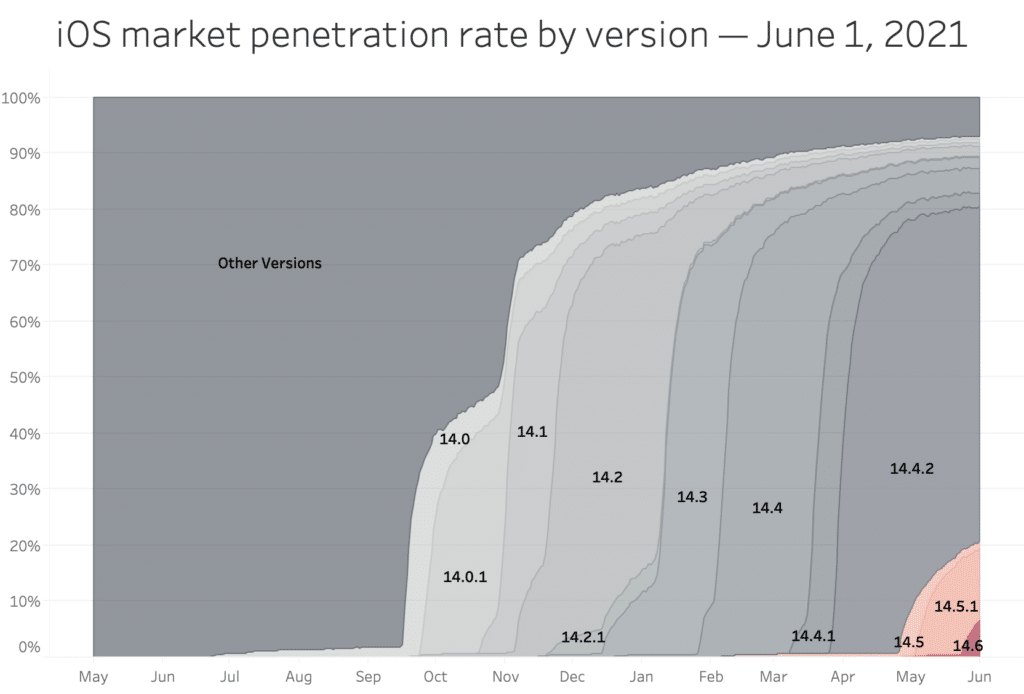
What is the iOS 14.5+ adoption rate, and why is it so low?
There are always two phases to the release of a new iOS version:
- Apple makes the update available to users who know to go looking for it. These are the early adopters who follow the news and want to stay up to date with the latest and greatest.
- Apple begins pushing out the update proactively. This is when the red dot shows up on the Settings app, but the new version is also proactively installed in the background for users who would never remember to update otherwise.
Apple generally doesn’t move past phase one until they’re really sure that the new release has no issues. In the case of iOS 14.5, there were a few ATT-related bugs in the initial version, and a pretty serious unrelated security issue with WebKit. Apple patched one of the ATT bugs and the security issue with iOS 14.5.1, but still held off pushing users to update from iOS 14.4.2.
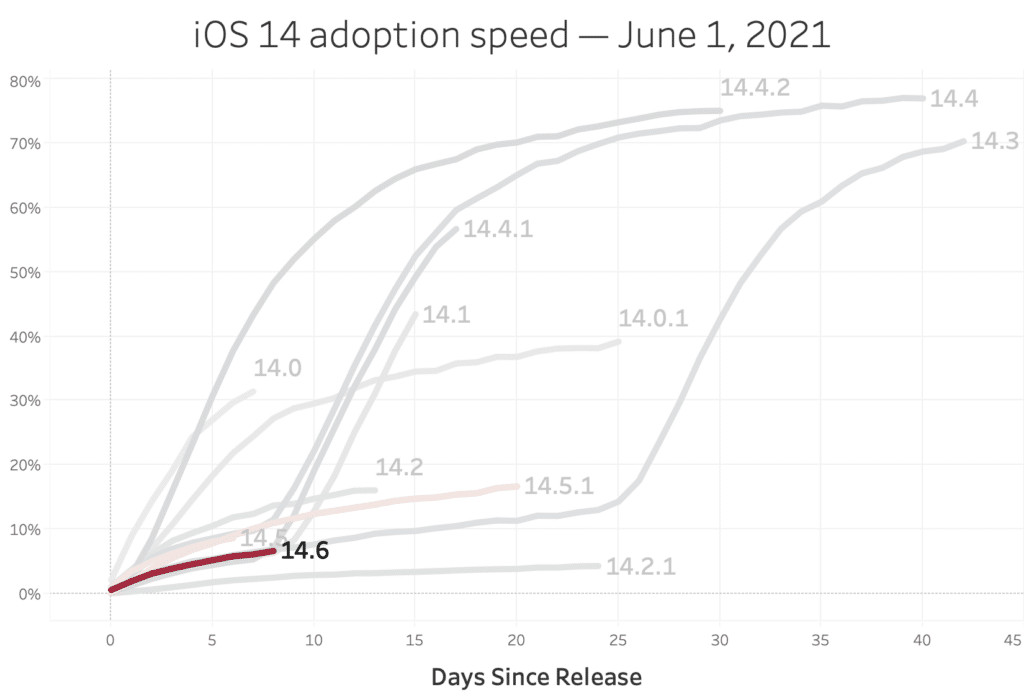
Looking at past iOS 14.x releases, we can clearly see that iOS 14.5 and 14.5.1 never moved past the first phase. However, there’s a clear group of updates that took off after about a week, and iOS 14.6 is ripe to hit a similar inflection point any day now.
With ATT enforced, how many installs can be attributed via IDFA?
All of the ATT opt-in numbers floating around right now (which we’ll discuss in the next section) are for only one side: either the advertiser or the publisher app. But in order to use the IDFA for attribution, the user must consent via ATT on both ends.
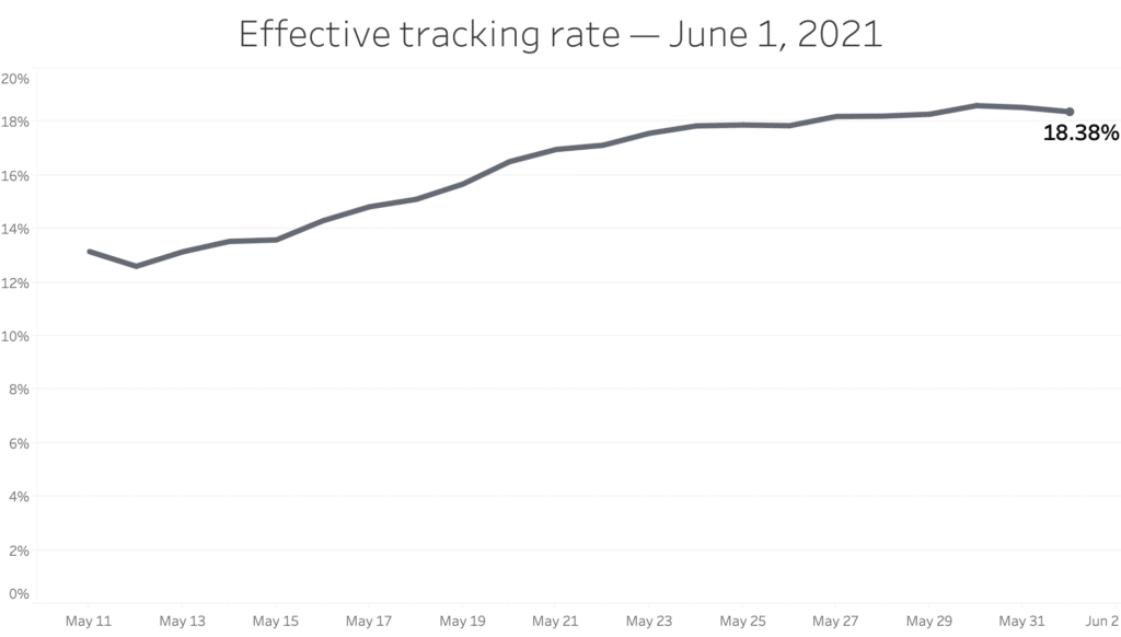
To get an idea of the true impact of ATT, we need to compare the rate of installs attributed to ads on iOS 14.5+ with the baseline from previous iOS versions. This metric is the real deal — the elephant in the room that no one is talking about yet. And as you’d expect, it’s much lower:
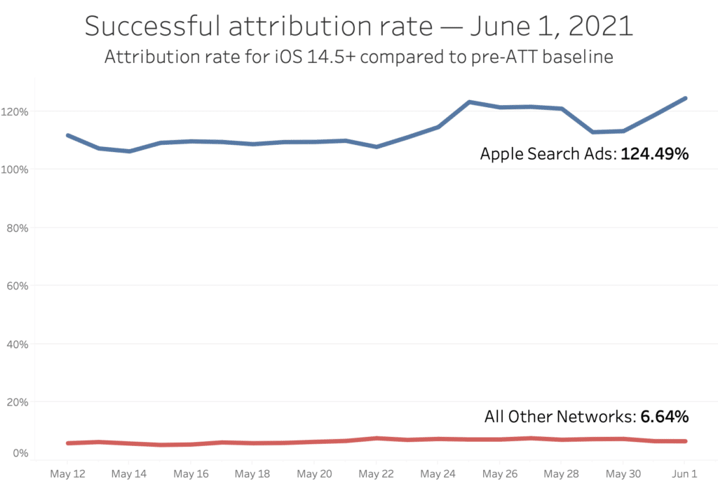
As of writing, the rate of successful attributions is slightly above 6.5% of the pre-ATT baseline. This means that compared to how things used to be, device-level insights are now missing for 14 out of every 15 ad-driven installs.*
However, there are two important caveats to this:
- Apple Search Ads is a completely different ballgame. Because ASA uses its own AdServices API for attribution, it is exempt from ATT restrictions. In fact, the rate of device-level attributions for ASA is tracking slightly higher on iOS 14.5+ and has even grown a bit over the last few days.
- Several MMPs are violating the ATT policy by fingerprinting opted-out users. This means that much of the enormous gap created by missing IDFAs is hidden right now, but that won’t last once Apple starts enforcing the policy component of ATT.
* For the mathematically-inclined, this metric is calculated by taking a sample of apps known to be showing the ATT prompt and running ad campaigns, and then comparing the difference between the attribution rate (attributed installs / all installs) for versions of iOS < 14.5 and > 14.5. For example, if 10 out of every 100 installs are attributed on iOS < 14.5, and only 1 out of every 100 is attributed on iOS > 14.5, the metric would be 10% (indicating that data for the other 90% of ad-driven installs is now unavailable due to ATT).
How many users are opting in via ATT, and what does this data tell us?
While the attribution rate discussed above is the most important metric, the number of ATT opt-ins is also useful because it (theoretically) indicates how many users give consent to “tracking” when asked, and what overall end user sentiment is toward ATT.
In reality, there has been a lot of confusion about these numbers, and what they mean.
The next section will take a dive into the various public ATT opt-in metrics, how they’re being calculated, and why this leads to so many discrepancies. But this is a case where looking at the raw data is actually helpful too, so let’s begin with a few basic breakdowns of ATT data we see in Branch traffic:
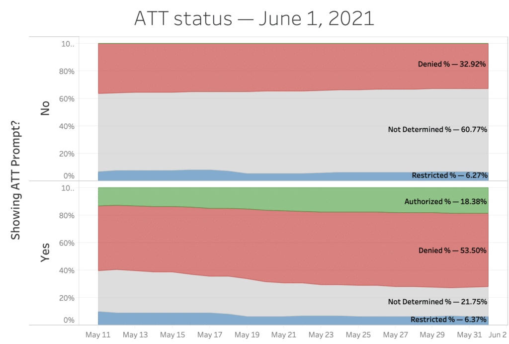
This graph shows ATT status for users of apps showing the ATT modal (bottom) and apps not showing it (top). As a reminder, these are the definitions for each status, adapted from Apple’s documentation:
- authorized: The value returned if the user authorizes access to app-related data that can be used for tracking the user or the device. This includes access to the IDFA.
- denied: The value returned if the user denies authorization to access app-related data that can be used for tracking the user or the device. This value is returned when the user sees the ATT prompt and selects “Ask App Not to Track”, and also when the user opts out device-wide.
- notDetermined: The value returned if a user has not yet received a request to authorize access to app-related data that can be used for tracking the user or the device.
- restricted: The value returned if authorization to access app-related data that can be used for tracking the user or the device is restricted. Apple lists an array of situations for when the restricted status is expected, including child iCloud accounts, device management profiles or brand-new iCloud accounts.
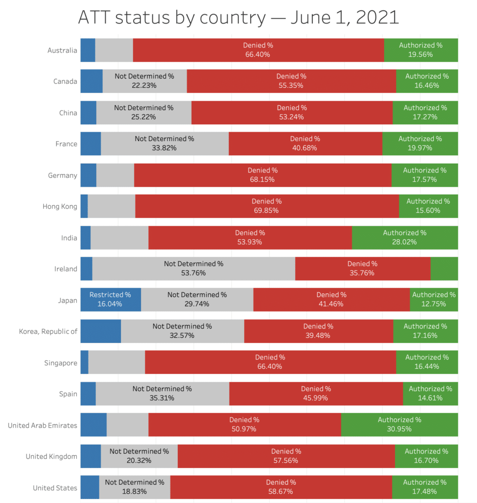
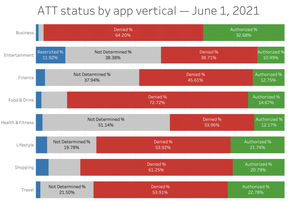
Here is the same raw data for apps showing the ATT prompt, broken down by country of traffic origin and top app verticals:
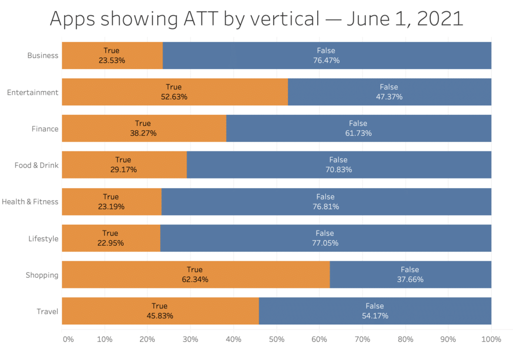
Finally, here is a comparison of how widely implemented the ATT modal is across verticals:
What do the various “ATT opt-in rates” mean, and why are they all so different?
Here’s a quick explainer of top-line numbers getting most of the attention over the last few weeks.
ATT opt-in metric 1: Percentage of opted-in iOS user base.
- Where have you seen it? This is the top-line number being reported by major platforms, including the widely cited iOS 14.5 opt-in rate report by Flurry.
- What is the current range of numbers? Depending on the source and region, this opt-in rate has fluctuated between 12% and 25% thus far. Unfortunately, some of the early calculations of this metric incorrectly included data from apps that weren’t even showing the ATT prompt, leading to artificially low numbers that many privacy advocates – and most mainstream media articles – trumpeted as overwhelming evidence that users hate “tracking.”
- How is it calculated? The equation is authorized / (denied + authorized), measured from active app users on the date in question. This means a user who interacts with 10 different apps on a given day will be included in the calculation 10 times, with each reflecting the user’s ATT status for that app.
- What does it mean and why is it useful? This metric reflects what you can think of as the live opt-in status of iOS users, meaning that it stays up to date as users opt in and out of ATT for individual apps over time. It helps to quantify how much AppTrackingTransparency is reducing the overall “tracking capacity” of iOS apps, compared to pre-ATT launch.
- What are the gotchas? This metric does not provide useful insight into how users are responding when presented with the ATT modal.
ATT opt-in metric 2: Percentage of users who select “Allow” when shown the prompt.
Source: AppsFlyer
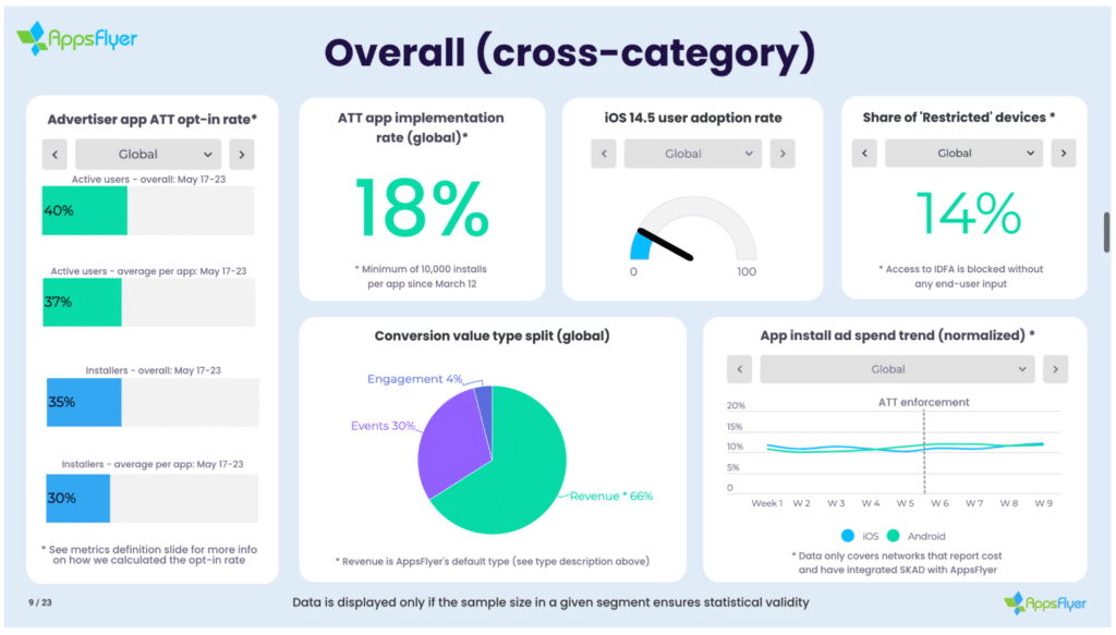
- Where have you seen it? The broadest study of this metric appears to be coming from AppsFlyer. If you’ve heard any anecdotal reports from individual app developers, this is most likely the number that they are referencing.
- What is the current range of numbers? Because this metric is often being shared at the individual app level, it literally runs the gamut. Reports are floating around of opt-in rates that range anywhere between 1% and 60%. However, according to AppsFlyer‘s data, the global average is currently around 37%.
- How is it calculated? The equation is authorized / (denied + authorized), measured at the time the user interacts with the prompt. When the requestTrackingAuthorization() method is called to display the ATT prompt, a developer can immediately capture the ATT status after users make their selection. (If the user has disabled ATT at the device level, a status of “denied” is returned by default.)
- What does it mean and why is it useful? This is the number that most closely answers the question of how many users decide not to share their data after seeing the ATT prompt. That makes it useful for measuring user sentiment toward ATT, and the impact of the optimizations developers make to their ATT presentation.
- What are the gotchas? Unfortunately, this data is challenging to get at scale, because collecting the data requires some additional instrumentation work at the individual app level. And although it’s a helpful indication of user preferences toward tracking, it does not reflect the full impact of ATT on the app’s measurement capacity.
ATT opt-in metric 3: Percentage of ad impressions containing an IDFA.
- Where have you seen it? If you’ve come across opt-in rates that originated from an ad network (for example, in an article like this one from VideoWeek), this is the metric being cited.
- What is the current range of numbers? Depending on the ad network and region, the rate appears to range between about 15% and 30%.
- How is it calculated? This is the number of individual ad impressions that contain an IDFA, which is only possible after the user has opted into ATT for the app that is showing the ad. A single app can generate multiple ad impressions for the same user, each of which will be included separately in the calculation.
- What does it mean, and why is it useful? Unlike the first two metrics, which are closely aligned to opt-in rates in advertiser apps, this metric almost exclusively reflects the publisher side of the equation. That makes it useful for apps looking to get an idea of what impact ATT will have on their monetization strategy.
- What are the gotchas? Since this metric can reflect opt-in data from multiple ad impressions per user session, it’s not an accurate way to demonstrate how many users select to not share their data when they see an ATT prompt.
While all of these opt-in metrics are interesting, they don’t tell the whole story for two reasons:
- There is a cohort of users with an ATT status of “restricted.” This status indicates that a user is not allowed to make ATT selections at all. Apple lists an array of situations for when the restricted status is expected, including child iCloud accounts, device management profiles or brand-new iCloud accounts.
- Users who have not seen the ATT prompt are de facto the same as opted-out. Whether this is due to the app developer choosing not to implement ATT, or simply delaying the presentation of it for optimization purposes, users who have not seen the prompt cannot be “tracked” for as long as this is the case.
Because of these last two points, any rate calculated with the equation of authorized / (authorized + denied) might help us understand user sentiment toward ATT but doesn’t tell the whole story of how it’s impacting mobile marketing overall.
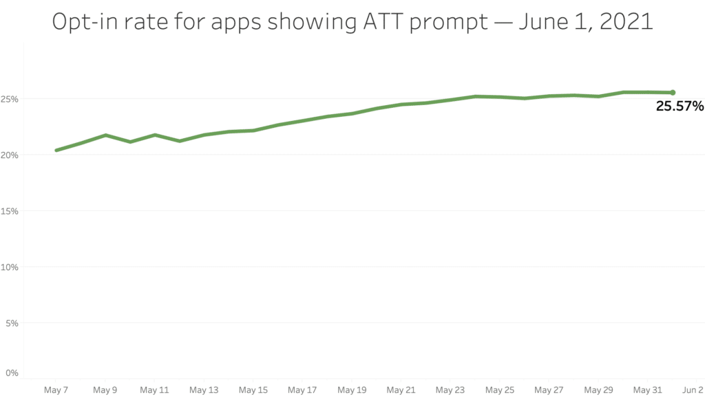
A more insightful metric — and the one we’ve been recommending to Branch customers who want to understand the true opt-in rate — is a “tracking allowed” rate calculated as authorized / (authorized + denied + restricted + not_determined).
We’ve been looking at this rate from Branch data, and it’s obviously somewhat lower than the other metrics…but still high enough to raise doubts about the media narrative that “all users hate tracking,” and continuing to grow gradually as more users see the ATT prompt over time.
What other rates are useful, and what do they tell us?
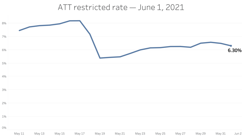
The restricted rate (users who cannot be shown the ATT prompt for various Apple-defined reasons) was artificially high for the first few weeks, presumably due to a bug on Apple’s end. It abruptly on May 18, suggesting that Apple finally fixed this issue:
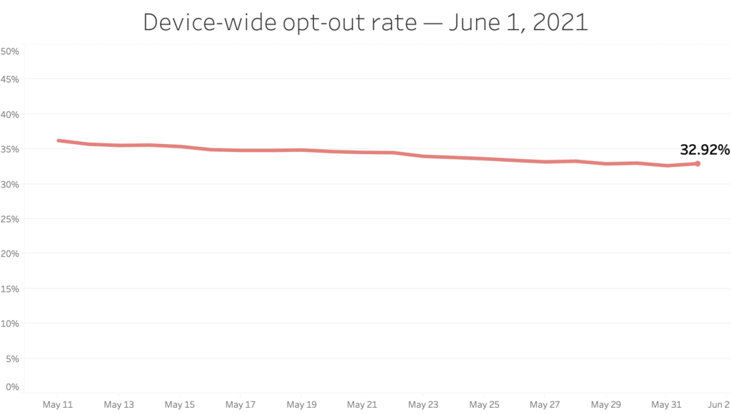
The device-wide opt-out rate indicates how many users have enabled the device-level ATT toggle. This is calculated by looking at the rate of denied statuses for apps that are not showing the ATT prompt. It’s decreased slightly over the past few weeks, perhaps reflecting the preferences of users who update quickly.
What happens next?
There are a few key inflection points to watch for over the next few weeks:
- When will Apple start pushing the iOS 14.6 (or 14.7) version to a broader audience? They’ve clearly been slow-rolling this update so far, but that can’t last forever.
- When will Apple begin truly enforcing the ATT policy? Right now, several MMPs are providing fingerprinting-based workarounds, which is leading to a false sense of security among many advertisers and ad networks, and some doubts about whether Apple is actually serious about this initiative.
- What will Apple announce at WWDC 2021? Though it seems incredible to think about this, the announcement of iOS 15 is less than a week away. If Apple doubles down on additional privacy-related OS changes, it will be a good indication that they’re in this for the long haul.
Ultimately, one thing is clear: obsessing over these data points doesn’t change the reality that Apple has used AppTrackingTransparency to fundamentally shift the narrative around mobile user privacy: IDFA-based, device-level attribution data is now far scarcer. SKAdNetwork will help fill the gap, but going forward, app marketers will need to find new ways to drive growth and measure results. Branch is here to help.