
Driving installs is easy. Getting installs that turn into registrations, purchases, and repeat customers is harder. Most teams scale campaigns before they know what’s actually working: which routing gets people into the app, which onboarding keeps them there, which creative drives real conversions instead of vanity metrics.
Here are six tests to run before you spend more.
Test 1: Paid app install campaigns vs. mobile web with smart banners
The question: Should paid traffic go straight to the app store or to mobile web with an app download banner?
Why it matters: Paid app install campaigns are expensive. Sending users to the mobile web with a banner often costs less per qualified install, but the tradeoff isn’t obvious until you actually test it. Directing users to your mobile website first gives you more control over messaging, lets you filter for real intent before pushing someone to the app store, and can lower your effective cost per install (CPI) — especially if your mobile web experience is good enough to convert users who weren’t ready to install on the first click.
How to test it: Run two campaigns to the same audience.
- Campaign A: Standard app install ads pointing to the app store.
- Campaign B: Direct ads to your mobile website with a smart banner that prompts install.
Measure CPI, downfunnel actions like install-to-registration or install-to-purchase rates, and cost per qualified user.
What to look for: If sending users to the mobile web with a banner gets you a lower cost per qualified user, that’s the more efficient path. If app install campaigns convert better post-install, the direct route wins. You won’t know until you test both.
Test 2: App store vs. mobile web fallback
The question: When someone clicks a deep link but doesn’t have your app, should they go to the app store or fall back to mobile web?
Why it matters: The default answer is usually “app store,” but that’s not always right. If someone’s not ready to install, forcing them to the app store just creates friction, and they bounce. Falling back to mobile web keeps them in the experience, lets them finish what they came to do (check a price, read an article, look at a product), and gives you another shot at converting them to install later with a Branch Banner. This is especially true for purchase-driven campaigns, where requiring an install before checkout adds unnecessary steps and risks losing the sale entirely.
How to test it: Customize your link redirects to split traffic between the app store and a mobile web fallback for users without the app installed. Track both so you can see what happens next: conversions, installs, and whether people who install later convert better than people who installed immediately.
What to look for: If fallback-to-web users end up installing at higher rates and sticking around longer, you just reduced friction at the moment that matters most. If routing straight to the app store gets you faster installs with no conversion hit, keep it.
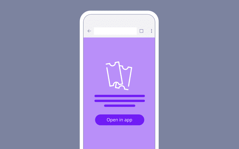
Test 3: Web-to-app banner messaging and design
The question: What combination of banner size, creative, messaging, and CTA actually gets people to install?
Why it matters: Banners need to give browsers a reason to stop and install without killing the experience they came for. The difference between a generic “Get the App” and a benefit-driven message tied to what they’re looking at can double or triple your conversion rate.
How to test it: There are a lot of variables to test here.
- Banner format: Full-page interstitial vs. minimally intrusive smart banner
- CTA copy: “Get the app” vs. “Open in app” vs. “Continue in app” vs. “Download now”
- Messaging angle: Benefit-driven (“Track your order in real time”) vs. feature-driven (“Download our app”)
- Visual design: Branded look vs. platform-native style
Test one variable at a time, and use Branch’s A/B testing to split traffic across as many variants as you need. Start with banner format, then move to CTA, then messaging. Run each test for at least two to three weeks to reach significance.
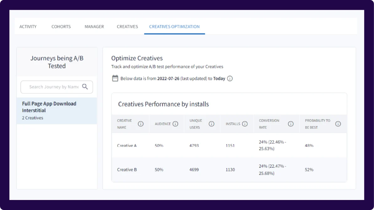
What to look for: View-to-install and click-to-install rates are your primary metrics. Branch’s “probability to be best” percentage tells you which variation is likely to perform best over time, but keep context in mind when comparing performance: Full-page interstitials naturally have higher dismissal rates than smart banners because users have to dismiss them to keep browsing. When in doubt, compare conversion rates, not dismissal counts.
Check out this blog for more Banners A/B testing tips and tricks.
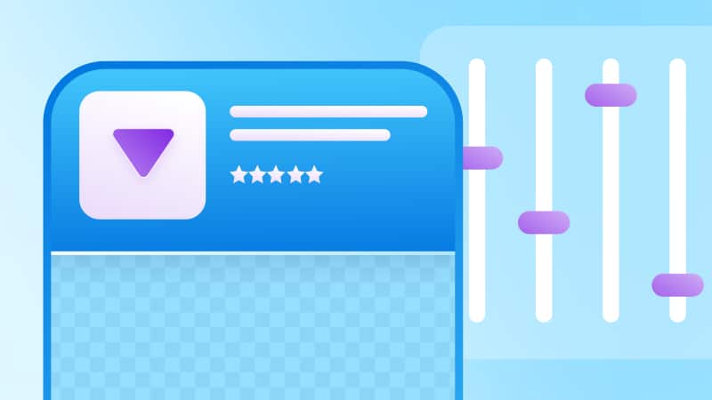
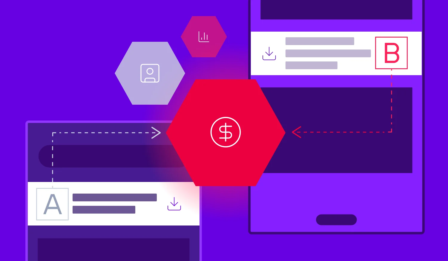
Test 4: Generic app store pages vs. custom variations
The question: Should all your traffic land on one generic app store page, or should you create different versions tailored to campaigns and audiences?
Why it matters: Personalized app store pages generally convert better because they match what someone already expressed interest in. A few examples:
- Creator-driven traffic: If a creator shares your app link and a user clicks to an app store listing featuring that creator’s content (via Custom Product Pages (CPPs) on iOS and custom store listings on Android), they’re far more likely to install.
- Marketplace apps: If your app has multiple brands inside it (think a multi-brand retail app or travel marketplace), showing a user the specific brand they searched for on the app store page drives higher conversion than a generic listing.
- Campaign-specific messaging: If you’re running a paid campaign targeting new users with a “Start your fitness journey” CTA, your app store page should show onboarding imagery and messaging about getting started, not advanced features for power users.
How to test it: Build two or three CPPs to highlight specific features, content, or themes for targeted audiences. Use Branch to route users to the right page, then measure app store conversion rates and post-install engagement.
What to look for: If custom pages lift install rate even 10%-15%, the compounding impact on customer acquisition costs (CACs) is significant. If there’s no lift, the problem’s probably upstream.
Test 5: Standard onboarding vs. contextual first-session experiences
The question: Should every new user see the same onboarding, or should what happens in the first session change based on where they came from and what they were trying to do?
Why it matters: Someone who installs your app after clicking “Track my order” in an email doesn’t want a three-screen tutorial on features. They want to see their order. Generic onboarding creates friction for high-intent users and increases the odds they won’t finish what they came to do.
Deferred deep linking fixes this. When someone clicks a Branch link, installs the app, and opens it for the first time, Branch passes context from the original click into the app. That means you can route them straight to the right screen — order tracking, a specific product, a promo — or show onboarding that’s actually relevant to why they installed.
How to test it: Use Branch’s deferred deep linking to build two paths.
- Path A: Standard onboarding (tutorial, permissions, generic welcome).
- Path B: Skip or shorten onboarding and route people directly to the content or feature they clicked, with optional context (“Here’s your order status” or “Your 20% off code is ready”).
Measure completion rate of the first action, Day 1 retention, and Day 7 retention.
What to look for: Contextual onboarding almost always beats generic for high-intent users. The question is whether it confuses low-intent users who need more hand-holding. If it improves activation and retention across the board, make it the default. If certain segments tank, segment your onboarding by traffic source.
Test 6: App install incentives
The question: Which type of incentive drives the most valuable installs, and does the specific offer format matter?
Why it matters: If you’re using incentives to drive app installs (discounts, credits, free trials, exclusive content), you need to know two things: which incentive type attracts users who actually convert, and whether the way you structure the offer changes behavior.
For discount-driven apps, the format matters. “$10 off” might convert better than “10% off” for low-ticket items because the dollar amount feels concrete. For high-ticket items, “20% off” can beat “$50 off” because the percentage sounds bigger. But beyond format, you also need to test incentive types: does a discount drive better long-term value than free shipping? Does a free trial convert better than a first-purchase credit?
The incentive that drives the most installs isn’t always the one that drives the most revenue. Branch lets you track who actually converted, what they bought, and whether the incentive cannibalized full-price sales or attracted one-time users.
How to test it: Run parallel campaigns with identical creative, targeting, and messaging, but swap the incentive. Use Branch links to tag each variant so you can measure install rate, redemption rate, average order value (AOV), and total revenue per cohort. Track downstream events (purchase, repeat purchase, subscription renewal) back to the original campaign.
What to look for: Revenue per dollar spent, not install volume. If one incentive drives more installs but lower AOV or worse repeat rates, it’s not the winner. Compare lifetime value (LTV) across cohorts to see which incentive attracts users who stick around and spend.
Test to prioritize, not to optimize everything
There are infinite levers you could pull to improve app growth: different ad creatives, new channels, more landing page variants, adjusted targeting. A/B testing shows you which changes actually move the needle.
Branch ties downstream conversions back to the original campaign and entry point, so you’re measuring the full impact: whether users who came through mobile web convert better than those who went straight to the app store, whether personalized onboarding improves Day 30 retention, and whether one incentive type attracts higher-value customers than another.
Ready to start testing? Get in touch.