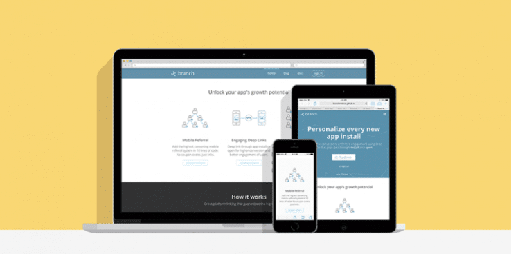
Since 2012, mobile device sales have surpassed personal computer sales and by the end of 2014, over 50% of the internet’s traffic will be from mobile phones. Is your website ready to deal with all those mobile browsers?
If your online presence hasn’t adopted a responsive design, you’ll be missing out on a ton of traffic, even if your company already has a mobile app – a recent study showed that nearly 67% of users say that they’re more likely to buy from mobile friendly websites.
Even though only 10% of the web is mobile friendly, you don’t need to be a wizard to build a responsive site. So how can you make your website more mobile-friendly?
What you need is to adopt the 4 basic elements of responsive web design:
- Fluid grids
- Flexible text and images
- Media queries
- Viewports
Let me show you an example of how to use these 3 elements in your website:
Fluid grids
Modern HTML layouts are based on grids – grids are the structure of our page. In responsive design, grids must be flexible and adapt to the user environment (screen size).
In the past, web developers used to design fixed grids, based on absolute pixels. That doesn’t work when there are many different screen sizes. Nowadays it is good practice is to divide our website in columns and use proportional units, usually in percentage (%) of screen size .
Creating a fluid grid requires a little bit of mathematics. You can use a stock solution, or roll your own.
If you want to build it from scratch, you must consider these variables: Maximum and minimum width of your pages. Maximum and minimum width of each columns. Margin between each column.
When building your own grid system, all these variables will change the way you would structure your CSS, which makes it a not so easy task.
For this tutorial, let’s grab a simple case, let’s say I want a 6 column website without margins and without maximum and minimum widths.
Our CSS code will look something like this:
{% highlight css %} .grid .col-1 { width: 16.666%; } .grid .col-2 { width: 33.333%; } .grid .col-3 { width: 50%; } .grid .col-4 { width: 66.664%; } .grid .col-5 { width: 83.333%; } .grid .col-6 { width: 100%; } {% endhighlight %}
This way, you will always divide your layout based on percentages. For instance, if you want to display a text paragraph and an image in two same-sized columns, your HTML will look like this:
{% highlight html %}
    <div class=”grid”>
        <div class=”col-3”>
    <img src=”birds.jpg” />
    </div>
    <div class=”col-3”>
        Birds are awesome!
    </div>
    </div>
{% endhighlight %}
Flexible text and images
Flexible text: There are many ways to accomplish flexible text, but the most basic is the EM unit.
Originally, EM comes from typography; it was used in the past to determine the width of the uppercase M letter. This was useful when people used wood blocks to print phrases, because this way they had a key letter to against which to measure all the other letters.
In CSS, 1 EM corresponds to the font-size value of the parent HTML element. For example, if my <body>’s font-size is 10px, in a <div> inside the body, 1 EM = 10PX, or 1.2 EM = 12PX. This way, if we structure the CSS of our divs with EM and later change the body font-size, it will change the div font-size automatically and proportionally.
Flexible images: To make images flexible, we can define their size using a percentage (%) as the unit. We can even define a maximum width size so as not to not distort the image if the user’s screen is too wide.
{% highlight css %}
    img {
        max-width:1000px;
        width: 100%;
    }
{% endhighlight %}
We can use our flexible grid HTML example as the use case.
Media queries
Last but not least, let me introduce you to the magic of media queries:
Media queries are a CSS3 feature which allows us to identify the resolution and pixel density of a user’s screen.
The syntax of media queries is:
{% highlight css %}
    @media (parameter-name: value) {
        css-rule { }
    }
{% endhighlight %}
Let’s say you want to hide a banner when the screen size is smaller than 992px:
{% highlight css %}
    @media (max-width: 992px) {
        /* Here goes your CSS: */
        .banner {
            display:none;
      }
    }
{% endhighlight %}
Media queries could be a topic for a whole article, but here’s good tutorial if you want to take a look at media queries in depth: https://www.sitepoint.com/web-foundations/media-queries/
Viewports
The final essential component of responsive web design is the Viewport.
When a device loads your website, you need to tell it that the website scale should be the same size of the screen device. To do so, paste this in your website’s head tag.
{% highlight html %}
<meta name=”viewport” content=”width=device-width, initial-scale=1.0”>
{% endhighlight %}
That’s all for today. I hope you enjoyed this article and I hope you apply the knowledge you have learned here. See you next time.
Ricardo is a lead front end engineer at Branch Metrics, a full service, deeplinking solution for mobile apps. Branch links have the power to deeplink through app install and open, allowing the app developer to deliver a personalized post-install experience. Branch links can be used to build full user-to-user referral programs with automatic install attribution and rewarding, or for automatically deeplinking to content post-install. Also, the Branch analytics dashboard gives insights into where organic installs are coming from, as well as interesting metrics like install conversion funnels and k-factors of growth features.
