
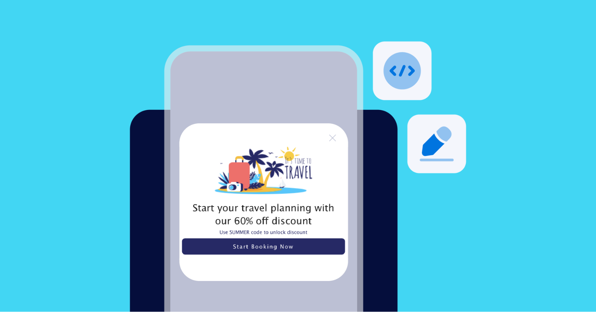
The Branch dashboard provides a basic WYSIWYG view editor that allows you to change the color, size, and orientation of the key elements that make up a Journeys smart banner. At the same time, harnessing the power of Branch’s CSS editor tool gives you much more flexibility and granular control over every aspect of your banner. This allows you to maximize the potential of smart banners and reach your user acquisition and reengagement goals.
For CSS refresher resources, I highly recommend W3Schools. The site has a lot of examples on using CSS. It also gives you hands-on practice writing CSS code in the browser-based editor.
The CSS editor
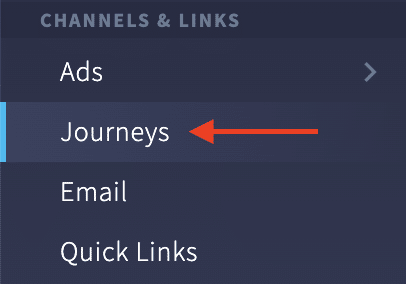
Here’s how to work with Branch’s CSS editor for Journeys banners. First, you can find the Journeys section under Channels & Links in the Branch Dashboard.
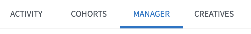
Next, visit the Manager tab, which will open the Journeys manager. You can either choose to edit an existing banner or create a new banner.
After selecting the creative for your banner, a preview will display along with another set of tabs. By default, you will land on the View Editor tab, which allows you to select banner elements and customize them using the UI. However, to get the most flexibility in customizing your Journeys banner, we recommend using the CSS Editor tab.

Here you will notice the CSS code. Before you begin customizing a banner, let’s review the various components that make up its anatomy. This may help you gain a better understanding of the elements you’ll have to work with when customizing a Branch banner.
Anatomy of a Branch Journeys banner
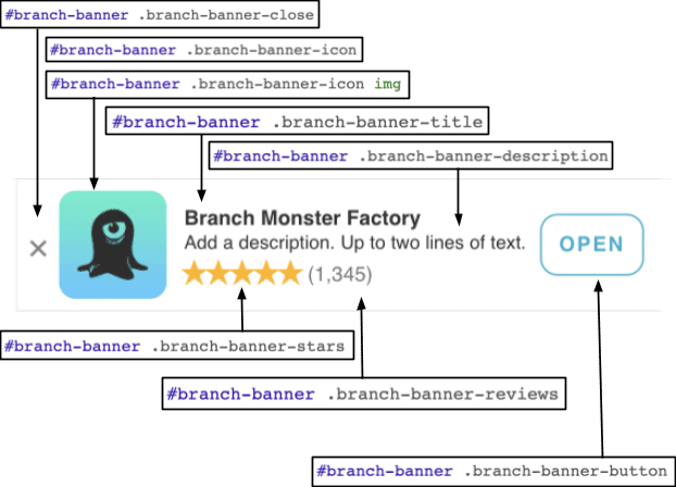
A banner is made up of two main groups: a class named branch-banner-left/ and a class named branch-banner-right. The branch-banner-left class contains elements like the close button, icon, title, description, stars, and reviews. The branch-banner-right class consists of the CTA button. It is important to note that any changes you make to the styles of these classes will affect all child elements.
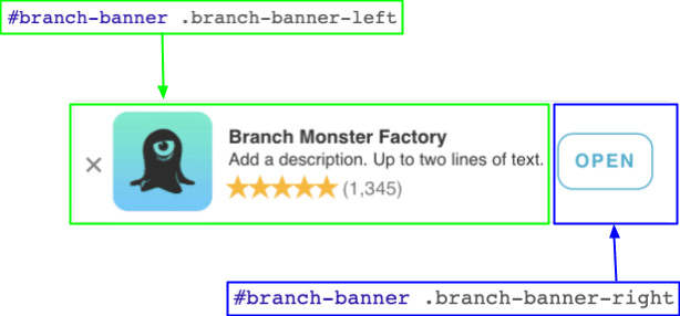
Apart from these two classes, a Branch banner consists of the following main elements:
branch-banner-closespecifies the style for the x button, which dismisses the banner when the user taps it.branch-banner-iconis the container for the app icon, andbranch-banner-iconimg is the actual image for the icon.branch-banner-titleis the title displayed on the Branch banner, which is the default name of your app. In this example, the title is Branch Monster Factory. It’s a sample Branch app available as a demo of our SDK’s functionality.branch-banner-descriptionis the description displayed under the title. In this case, it reads “Add a description. Up to two lines of text.” As this placeholder text indicates, a description may contain up to two lines of text.branch-banner-starsis the star rating graphics. Note: these don’t update automatically, so you need to manually update the stars to reflect your Play Store or App Store rating.branch-banner-reviewsis the text in parenthesis for the number of reviews the app has. It also needs to be updated manually.branch-banner-buttonis the CTA button.
Now that you have an understanding of the various parts that make up a Branch banner, let’s dive into how to customize it using CSS code.
Using CSS to customize a Branch banner
Let’s examine how to programmatically change the color of the elements. For example, we can change the background of the banner to black. To do this, we navigate to the branch-banner-content element and change its background value from white to black.
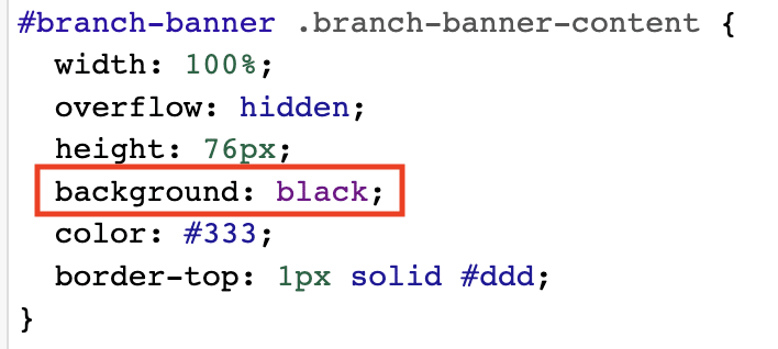
Notice that this makes some of the darker elements, like the text, harder to see. To remedy this, change the color of the close button (branch-banner-close), title text (branch-banner-title), description text (branch-banner-description), button (branch-banner-button), and reviews text (branch-banner-reviews) to white.

Now your banner has a black background with white text elements, thanks to the CSS code you edited.

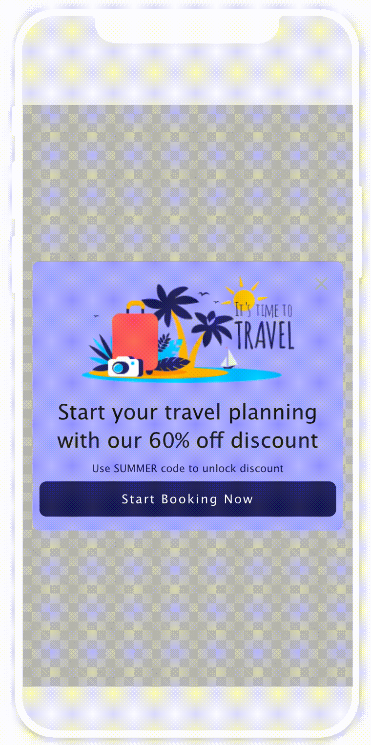
This is just scratching the surface of what’s possible. For example, let’s say you want to programmatically change the app icon. The first step is to find an image online, right click, and choose Copy Image Address to copy the URL to the image.
For this example, use this URL that points to a Branch icon: https://play-lh.googleusercontent.com/Mo4DV_61Wy5LP_dpiC2LiH5Nq3a26bOqHDypJh5WmuQhtdj1LkrRTVs4LEg_0X4f=w240-h480-rw.
Next, go to the img element for the branch-banner-icon and add a content property that specifies a URL with the value you copied.
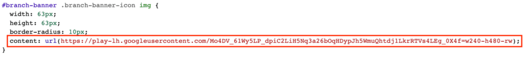
After you write this line of CSS code, notice that the app icon changed to reflect the edits you made.

An even more advanced use case is using CSS to animate Journeys banners. Some customers have asked about animating their banners, and some have even used GIFs to do so. While this approach works, a more performant and scalable solution is to animate the banner elements directly using CSS code.
Animated Journeys with CSS
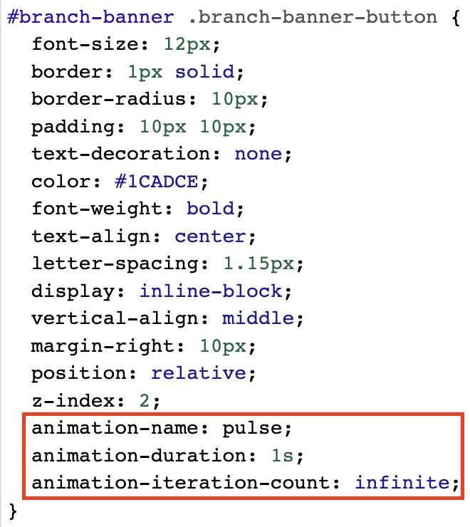
Here are some examples of how to animate a banner with CSS. This first example is a pulsating CTA button. It’s a more subtle animation that can be used to capture the user’s attention and prompt them to either install or open the app on their device.

The first step is to create the animation. You can use the @keyframes rule to create a keyframe animation, which you can name pulse. Set the transform’s scale to 1 at a timing of 0%, 30%, and 40%.. At 50%, set the scale to 1.15, and then at 60%, 70%, and 80%, set the scale to 1.
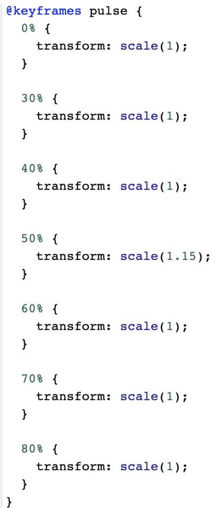
Now you’ve written the code to animate the pulse effect, but you’ll still need to apply it to the CTA button. To do this, navigate to the branch-banner-button. At the end of this code, specify an animation-name of pulse, an animation-duration of one second, and an animation-iteration-count of infinite so the animation loops indefinitely. Once you’ve made those edits, you should see the button pulse animation preview on the left side of the CSS editor where your banner is displayed.
Another example of creating an animated banner is to cycle through background colors.
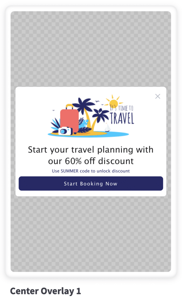
For this example, use the Center Overlay 1 creative from the Branch dashboard’s Journeys creatives section.
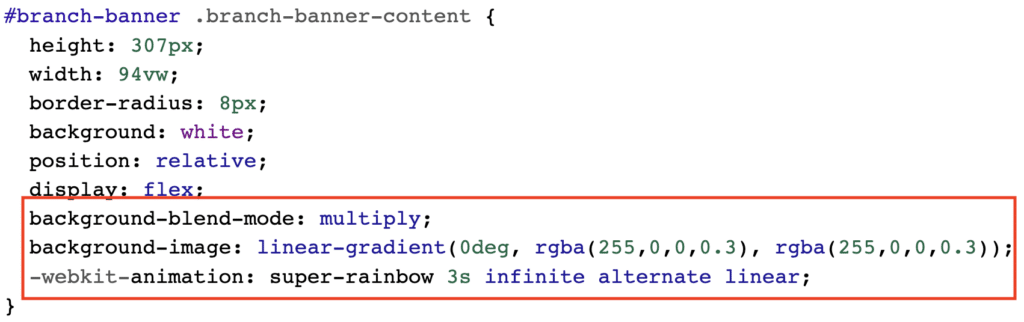
Here’s how to create a @keyframes rule named super-rainbow. Inside, you’ll be working with keyframes at 0%, 20%, 40%, 60%, 80%, and 100% through the animation. You will edit the background-image property and supply a linear gradient at 0 degree rotation, and then specify the RGBA colors of the rainbow with an opacity of 0.3. This way, the colors aren’t too opaque or overwhelming on the banner.
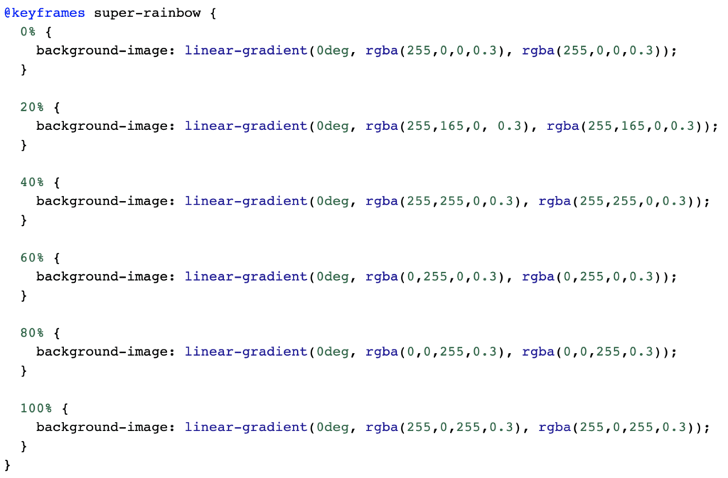
Now it’s time to apply the animation to the banner. Go to the branch-banner-content. Assign it a background-blend-mode of multiply and a background-image of a linear-gradient starting with a color of red at a 0.3 opacity. Next, add the -webkit-animation property specifying the animation name of super-rainbow, duration of three seconds, iteration count of infinite, and a value of alternate linear. Once you do that, you should see the background of your banner cycle through the various colors.
Get granular control over your smart banners
Now you can use the CSS editor on the Branch dashboard to get granular control over how your smart banners are stylized. By understanding the different elements that make up a Branch Journeys banner, you can create compelling banners for user acquisition and reengagement. You can even use CSS code to add lightweight animations to your Journeys banner, making them even more engaging for users.